Greetings capsuleers. Team Pirate Unicorns, a relatively new team with a strong focus on the new player experience (NPE), is here to talk about some new foundational contextual UI work that has been released on Tranquility today – new and improved tooltips.
Now, tooltips are a small but very important first step in radically overhauling and improving the experience for new players and those playing at all levels of EVE Online. This is because Pirate Unicorns believes that a strong and clear user experience underpinning the game as a whole, and useful to all, makes it much easier to provide an accessible new player experience.
The first piece in our new approach to the NPE is therefore to provide a much richer and wider range of contextual information, with one well-established means for this being tooltips. In today's release we have added new tooltips to a range of UI areas, replacing existing “hint”-style tooltips, and expanding the information available.
The areas covered by this first phase of tooltips are as follows:
- NeoCom sidebar buttons
- Character Sheet sidebar buttons (also new format applies to skills listing)
- Fitting Window elements comprehensively tipped
- Key Show Information window attributes for Ships and Drones
- Station Services buttons and tabs
- Star Map new format tooltips with better interactions and cleaned up information
- Selected Item window buttons
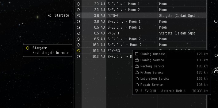
- Overview entries have tooltips showing icon, group name, and status information where applicable
- Brackets in space have mouse-over tooltips and groups of brackets close together in space are listed in a scrollable tip
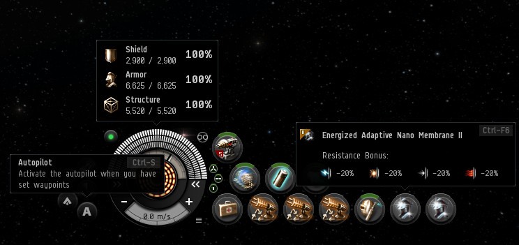
- HUD buttons, hitpoint bars, heat indicators, speed readout, etc. tipped
- HUD module buttons in new format but with a higher delay than other new tooltips to preserve the usability as seen currently
To give an idea of these, we have prepared some composite images for the dev blog, but these changes are now live and can be enjoyed on Tranquility.
This above image shows the new overview tooltips, demonstrating the status information that can be applicable in many cases (stations, containers, wrecks and NPCs are other examples), plus the new way of clearly presenting information on clusters of brackets in space. Notably, when the list of items is over 10, this interactive tooltip will be scrollable.
The all-important ship HUD is shown above with a selection of tooltips in composite. The displayed hitpoint readout, heat, capacitor and speed readouts are also tipped. All the elements have a tooltip and the modules tooltips have had a sprucing up.
At this point, we should mention that in general the response time of the new tooltips is much higher than the old “hints,” but we have made sure to tune the response time of the module tooltips to preserve the significant delay on them that we know is important in this case.
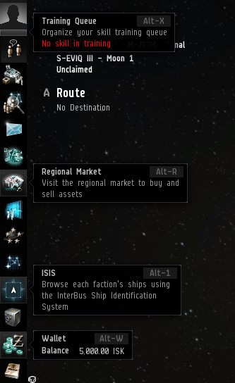
We are also improving the tooltips for many buttons such as the NeoCom above, as well as station services, the character sheet sidebar and the selected item window as indicated in the list earlier in this post.
This is not all though. We also have tooltips for all the elements of the Fitting Window, as seen in the following image:
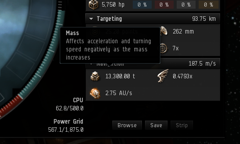
This work has also been extended into tooltips for the key attributes of ships and drones in their Show Info windows. For example, as shown below:

The Star Map system tooltips have been much improved, with some streamlining and cleaning up of information. Where relevant they are also interactive: for example, with station listings when set to display services.
As part of this cleanup we’ve removed the large extended information on orbital objects in the system, including stations that would pop up after a short delay. However, to make sure the station information for a system is still readily available, this detail has been added to the Show Information window for star systems under its own tab.
Predictive Mouse Movement
This release has a significant extra feature courtesy of some UI programming work done on the side: predictive mouse movement in menus.
Say what now? Well, what’s happened is that a method has been added to predict if the mouse cursor is heading into an expanded menu, preventing a mouseover update on other UI elements if this is predicted to be so. This is enabled for the NeoCom menu, context menus and the new interactive tooltips.
This is shown below – red is the old motion required and green is the new way unlocked by the prediction method.
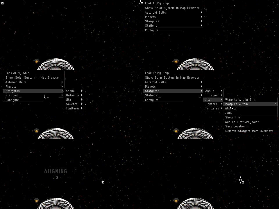
(In animated format)
This work has been built up from some initial A/B testing efforts and then a deeper dive into how tooltips and other contextual information can benefit all players and assist in crafting a much better new player experience.
This is the only just the beginning and we have plans to considerably extend the scope of new tooltips in EVE and to offer advanced tooltips in the future. We hope these improvements are useful to you all as you navigate your way around the many opportunities New Eden has to offer.
New to EVE? Start your 14-day free trial today.
Returning pilot? Visit Account Management for the latest offers and promotions.
