Greetings fellow capsuleers!
CCP karkur here with CCP Merc from Team Pirate Unicorns to tell you about some little side projects we have been working on lately, which we are delivering to you on 12 March in EVE Online Rubicon 1.3.
Directional Scanner Changes
A lot of you have asked us to improve the range input in the Directional Scanners. Currently you can only enter the scan range in kilometers (km), which is maybe OK if you are so lucky to be able to convert between that and astronomical units (AU) on the fly. However, most of us struggle with that conversion, to the point where many pilots have resorted to listing this chart in their bio for easy reference. It can make scanning quite tricky.
We have heard your pleas (and done some begging and crying ourselves), but we have much more ambitious ideas for the scanner. So we have, to be honest, been a bit reluctant to just put a tiny patch on it.
But the CSM raised the issue once again at the recent CSM summit, and CCP Delegate Zero suggested that we finally should do something about it. After getting great support from our scanner friends in Team Five-0, we decided to stop pushing back and just go for it!
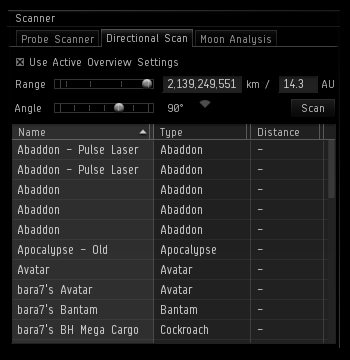
As of Rubicon 1.3, you will have three ways to enter the scan range: one slider and two input fields (one in km and another one in AU). Those three input options will be interconnected.
That means that when you enter “100,000” in the km field, the AU input field will display the corresponding distance in AU, and the slider, which is linear, will also update.
The slider can be used for input as well, and snaps to 5 predefined values (1 million km, 1 AU, 5 AU, 10 AU, and the max value 14.3 AU). Those presets, along with that fact that a directional scan is performed when you let go of the slider handle, will allow you to perform "short", "medium" and "long" scans super fast, which can be very handy to get a general idea what’s present in a system you jump into.
When you used the input boxes to set the range (useful for some more fine-tuned scanning), you will either need to hit “Enter” or click the "Scan" button to fire off a scan.

We also know that many of you have found it very difficult to work the linear scan-angle slider, since 5 out of the 7 scan angles occupy the first quarter of the slider’s length (a whopping 20 pixels!). We wanted to make it easier to use, so we changed the slider so it's no longer linear. Now there are seven evenly spaced increments representing 5, 15, 30, 60, 90, 180, and 360 degrees. We also added a cute little pie chart next to it that will help you visualize the coverage of the selected scan angle.
You can see the Rubicon 1.3 D-scan window below.

Additionally, after Rubicon 1.3, you will be able to click anywhere on the two sliders to have the slider value set to the closest available value, or use the mouse wheel to move the slider to the next tick in the slider. You will also find the slider handle is less fiddly to start dragging.
Word Filtering and Highlighting in Chat
We know how busy chat can be, and many of you have asked us for a way to highlight certain words in it. When our GMs asked us if we could add the ability to filter out words, I saw the perfect opportunity to feature-creep a bit and add word highlighting as well.
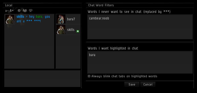
We decided to keep it very simple for now: Open the Word Filter window from any chat channel and add the words you never want to see in the chat in the first input field, and the words that you want highlighted in the next input field. There is also an option in that window to have the highlighted words always trigger a blink on channels, even though blink might be turned off for that channel.

Filtered words will appear as three asterisks (***) in the chat, and highlighted words will be displayed green and bold. This reformatting of the chat messages is all done client side, so you will be the only one affected by your word filters and highlighting. Also, word filters are stored on the server per pilot, so you won’t have to redo them if you play on more than one computer or happen to lose your client settings.
We’re quite interested in seeing how you will make use of the chat highlighting, but expect that many will choose to highlight their pilot names and nicknames. Some fleets or corporations might also instruct their pilots to highlight predefined keywords (such as “squad4”, “allBombers”, “SquadCmdrs”, etc) to grab the attention of relevant people. One of the things we love about the EVE Online community is your ability to find brilliant ways to use the game’s features, and I suspect you will come up with something for the highlighting which we had never thought of.
Changes to Notification Settings
Have you ever wished that you had more control over which Notifications make the Neocom button blink? Want to get a popup when your corporation has been war decced, but not on every bounty payment you receive? If so, you’re in luck, because we are adding the ability to set the Notification options on a group by group basis.
Similar to the chat filters, these settings, as well as the mail settings, will now be stored on the server, so they should apply to any computer you play on. While we were at it, we added a notification group for Insurance.
And then we hand it over to CCP Merc who'd like to briefly tell you about the results of his tinkering with the Information window for ships.
Fitting in your Fitting tab
Have you ever noticed the "Modules" tab in the Information window for your ship? It lists all the modules and charges fitted to your active ship. However, the tab is only present in the Information window for your active ship when you're undocked. I thought that was a bit restrictive, so I went ahead and made it available for your active ship while docked as well as any other ship in your personal ship hangar anywhere in the universe.
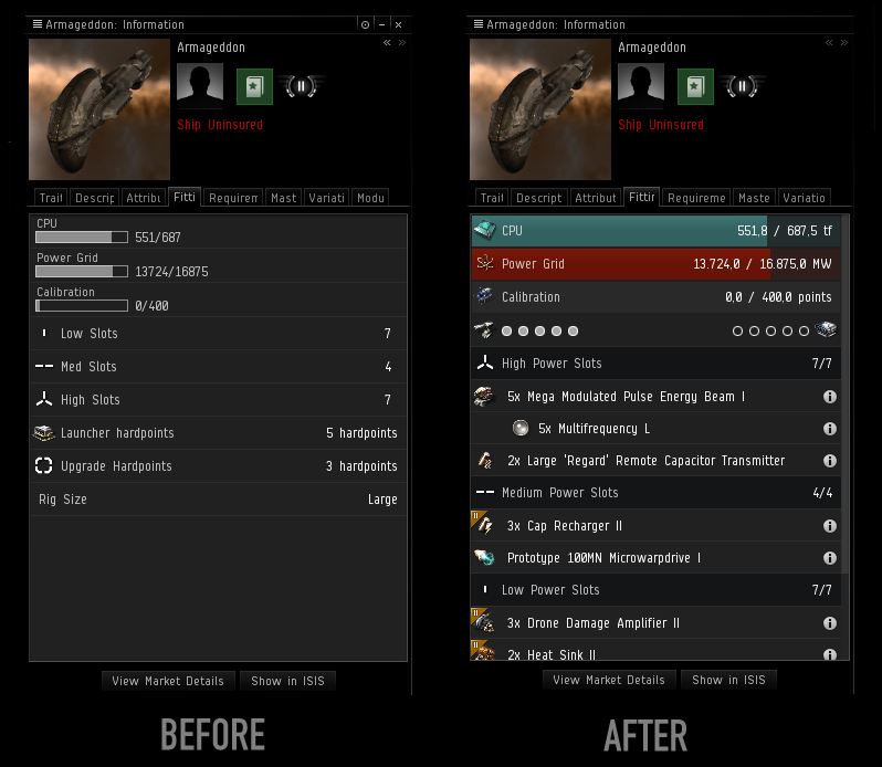
Also, having the module list in its own tab felt a bit excessive, especially since we conveniently already have a tab called "Fitting", so I decided to just merge these tabs together and give the existing content a little face-lift. Here's a comparison of what it looked like before and what it looks like now:

I also fixed some quirks the old Fitting tab had, such as how it would only show you remaining hardpoints instead of the total count for your active ship (notice the missing turret hardpoint entry in the "before" screenshot above).
Bars in your cargo
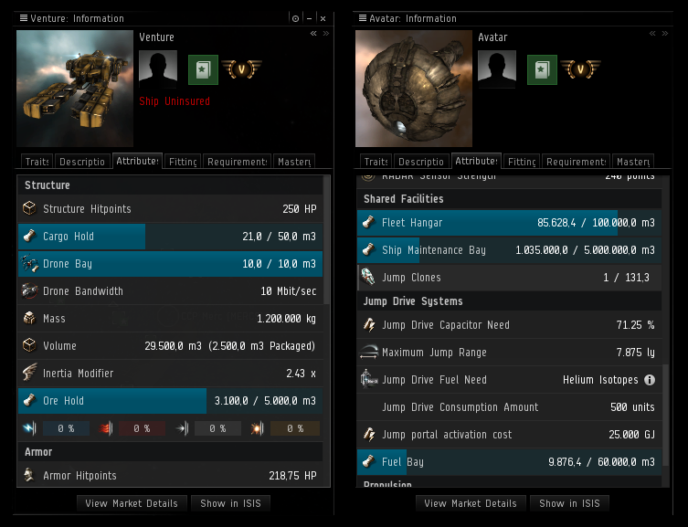
Since I was working on the presentation of attributes in the Fitting tab, I thought I might have a look at the Attributes tab as well. Now you will be able to see how much cargo space you’re using in each of the cargo bays on your active ship in the Attributes tab, like this:

Also, if you’re in a ship with a clone bay, you’ll find the number of clones stored in your ship in the Attributes tab instead of the Fitting tab, where it was previously located.
And finally, we added three new shortcuts for the tracking camera: one to toggle between “custom” and “center“ camera tracking modes, one to enable “custom“ camera tracking mode, and one to enable “center“ camera tracking mode. These shortcuts are not set by default, but are configurable in the ESC Setting menu.
That's it from us this time. Fly safe.
–CCP karkur
-CCP Merc