Hello space friends!
As many of you know, we have a few forum threads where you guys have been telling us what minor Quality of Life changes (so-called "Little Things") you want to see in EVE Online. And as some of you also know, I've been going through these threads, picking out the ideas and implementing them. You can read about some of these changes in my previous devblogs:
- U and I – Our Little Improvements Together
- U and I – Our Little Improvements Together V2
- U and I – Our Little Improvements Together V3
- Fleet Interface and other improvements in Retribution 1.1
- U and I made some changes: Odyssey UI Changes
- U and I made some changes: Odyssey 1.1. UI Changes
- Fleet, you fools! – UI Changes In Rubicon
I'm here today to tell you about some of these things coming your way in Rubicon 1.1! 🙂
One of the things that seemed to annoy you contract-crazy people a lot is that extra click needed to check the "Private" checkbox in the Contract Creation window and many have asked for it to happen automagically. In Rubicon 1.1. we are changing it so we check that box for you when you start typing or drop a character in the private field, so now all the forgetful people won’t have to worry about getting that "Either clear the name field or change Availability to "Private"" message when moving to the next page in the Contract creation window 😛
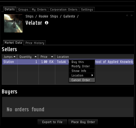
A few releases ago we added the option to highlight in blue your own orders in the "Details" tab in the Market (if you haven't found it yet, check out the "Settings" tab or read my devblog). When you have your orders highlighted, they can be right-clicked to be modified. At the time we added this feature, we figured we should probably not allow you to cancel the orders from there, just to save you from yourself. Based on your requests to have that functionality there, I'm guessing you don't want our help, so we are adding the "Cancel" action to that menu. Just don't come crying to me when you accidentally cancel your valuable market orders!

Ever been trying to view member details for more than one of your corp mates? It's "fairly" annoying that it's not possible if a Member Details window is already open, and you have rightfully pointed so out. We are changing it so if you try to view member details on a pilot now and one of those windows is already open, it will be closed and a new one will replace it.
Wading through the bureaucracy of insuring a ship when you own or have access to many ships? It's quite a task I tell you, and in my case leads to flying uninsured ships way too many times simply because I cannot be bothered to find the ship in the massive list of ships.
Wouldn't it be lovely to be able to just right-click your ship and directly open the Insurance Terms window for that one ship? That's what we thought too, so after Rubicon 1.1 goes out on the Tranquility server, that will be a thing.
In order to make that possible, the Insurance Terms window had to be rebuilt. While at it, we figured it would be nice to have the window "non-modal" and add some extra info into it, such as the picture and name of the ship type, as well as the ship name and the current insurance on it.
And since we were changing stuff there, we decided to make the pop-ups that inform you about insurance suppressible, mostly with your corporation and mass-fitters in mind but also for our own mental health as we were testing these insurance changes 😛
The last day before my extended Christmas vacation, I woke up to a tweet from one "Mr." Rhavas, where he presented a list of his Christmas wishes. One of his suggestions interested me a lot, and later that day as I was done wrapping up things for my vacation, I decided to just go for it.
What Rhavas suggested was to add a location search field in the Route Info panel, making it easier to quickly find a location to set a route to. It will search for Regions, Constellations, Solar Systems and Stations, grouping the results into those categories.
Please don't all now go around tweeting me your personal wish lists. This was just a great idea and perfect timing 😛 You can of course still tweet all sorts of accolades my way ;)…

I like things to be dragable. So when one of my co-workers asked me kindly if we could make the items in the "Variation" tab dragable so it was possible to drag them into the Compare Tool, I was all over it. That of course also means that you can drop them in Chat to create links, and add them to the Market Quickbar. In addition, you can now similarly drag and drop item types from the Contract Creation wizard, the Redeeming System, and other similar lists.
Lately I've been watching quite a bit of your awesome Twitch streams, and one night Sir Squeebles was running an event called Fits & Giggles. It's a sort of a gift exchange with fitted ships and when it's over all the participants go roaming in their new ships.
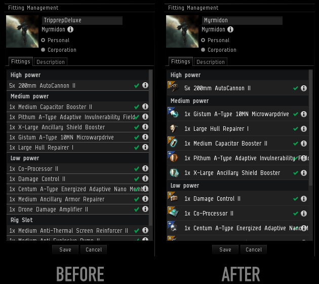
Well, one of the ships given out was a Myrmidon fitted with modules worth about 3 billion ISK. What struck me was that when the good Sir pulled up the fit in the Fitting Management window, nothing stood out that indicated that the fit was crazy expensive. As I was on vacation and had plenty of free time…, I went ahead and added the icons and tech overlays to the modules in the Fitting Management window so it will give you a better idea of what kind of modules are included in the fit.

(Hint: that Myrmidon loot piñata is still alive, so keep an eye out for it).
While I was at it and because I love drag & drop like previously mentioned, it only made sense to make it possible to drag the modules from the window and drop them in edit fields to create links.
And since you guys have been asking a lot for a shortcut to open the Fitting Management window, now seemed to be a good time to add that for you 🙂 The shortcut is not set by default, but you can configure it, like any other shortcut, in the “Shortcuts” section of the ESC window.
In a forum post where I told you guys that these changes were available for testing on the Singularity test server ("Sisi"), Nicen Jehr pointed out that hitting Enter in the search field in the Fitting Management window didn't actually execute search as most humans would expect. That was just stupid, so we fixed it right away 🙂
We know the attributes tab in the Show Info windows is a bit of a mess, and we want to fix that. We started in Odyssey 1.1 by changing the layout of the attributes. In Rubicon 1.1 we take another small step by arranging the damage resistance of ships and drones into bars similar to what you see in the Fitting window. This saves a bunch of space and also makes the info much more readable for you.
When working on this, I was a bit shocked by the mess that was the attribute tab for drones. About a million attributes that were not sorted at all. Since the drones are kind of like cute mini-ships, we thought it was a good idea to give them the same grouping as the attribute tab in the Show Info window for ships.
There are still plenty of things we can group together to make the attribute tab neater, and we'll be looking into that in the future.

Over and out! (btw, this devblog contains 8 smilies, which I believe is a personal best for me :))
-CCP karkur
PS. Industry guys, you are next on my list. 🙂
New to EVE? Start your 14-day free trial today.
Returning pilot? Visit Account Management for the latest offers and promotions.