Hello pilots.
My name is CCP Sharq and I‘m a UI designer for EVE Online. I‘m a part of Team Pony Express, that focuses on User Experience for EVE Online.
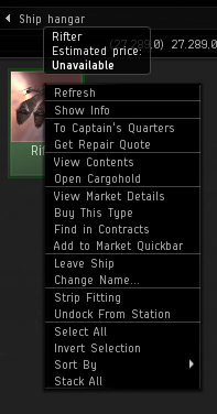
When looking at and playing EVE one day, looking for what to tackle next for our team, we noticed that the left mouse button is more or less underutilized when interacting with the client. Primary interaction pattern with objects in EVE are through a cascaded contextual menu that is better known to you the players as the “Right Click Menu“. That menu has been bloated with options and submenus upon submenus for the last 10 years and is often hard to find what you’re looking for and navigate to it without doing a lot of reading. The Contextual menu for a ship in your hangar lists out 20 options or more in some cases!

Found this in the backyard…
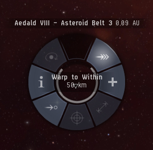
When researching alternatives to Right Click as a primary interaction, we remembered the Radial Menu that’s available when flying around in space. That control was implemented a long time ago and hasn’t received any love since then so it was time for giving it a second chance. In fact the radial menu UI pattern is going through a bit of a renaissance these days due to touch screen interfaces and it is becoming the weapon of choice for many UI developers both for touch and mouse input interfaces. This fitted perfectly to the plan; We had found our silver bullet.
Prototype, best type
The development of the radial menu was done using rapid prototyping, working closely with UI programmer CCP Karkur. We made a crude radial menu, just to get the look and feel right and then we put it through numerous iterations, mercilessly throwing out ideas that didn’t feel right, and trying out all sorts of different things to tackle the issues we encountered (and sometimes to create new ones). We went through this process without creating any client-quality code so as to keep progress fast. Later we User-tested a more complete version of the menu internally and also at EVE Fanfest, from that process we steadily ironed out kinks and optimized the experience.

How it works
To call up the radial menu you need to hold down the left mouse button on an item for a moment like on the original Action Menu. That works on brackets in space, the overview and on your Targets.
Different from the old radial menu, there is no need to hit the little button to trigger options, with the menu open the screen is divided into segments allowing for quicker interactions using gestures. Your commands can now be made quicker than through the old radial menu or the Right Click menu.
Designing the radial menu using only 8 slices is constraining, yet liberating. We went through numerous iterations on the layout schema and ended up with something we were happy with.
- Primary actions are at the 12 o’clock position in the menu. Primary actions are actions we feel are most used or unique to a particular type of object. Some examples:
o Jump for Star gates
o Board for Ships (in space)
o Dock for Stations
o Open Cargo for Containers
You get the picture.
- Targeting is always at the 6 o’clock position. That allows us to keep that consistent across the board. We tried having it as the primary actions for some things, like ships, and then it had to be elsewhere for items with other primary actions. It became messy pretty quick.
-
Show Info is always on the 9 o’clock position for a quick access to vital info.
-
Plus / More options are at 3 o’clock. There are options like Bookmark and Look at. We made a conscious decision on not going all in on migrating ALL THE OPTIONS into that submenu, some things are better left in right click menu.
- Navigation options are placed on the 45 degree axis; Align, Warp To, Keep at Range and Orbit. The range of these options depends on the distance of the mouse pointer from the center of the menu. So all ranges can be set in a single motion, their placement is deliberate to minimize errors.
Radial menu beyond Odyssey
The idea is to implement the radial menu in more places if you guys like it and will use it. Examples: When using the inventory, interacting with your ship in the hangar even for options on your weapons in the ship HUD.
We have also been playing around with a different radial menu to use for navigating celestials within your current system instead of the deep, deep right-click in space menu. Let’s see if we get around doing that.
Just go to Singularity and test the radial menu out!
… And one more thing, Fly safe!
CCP Sharq
New to EVE? Start your 14-day free trial today.
Returning pilot? Visit Account Management for the latest offers and promotions.