Greeting capsuleers, this is CCP Frellicus from Team Five 0 here to introduce our latest addition to the exploration of space in the universe of New Eden. I’m talking about a system that has been aptly dubbed “the sensor overlay”. Before we delve into the specifics of the sensor overlay let’s have a few words from my good teammate CCP Greyscale about the general premise of the feature.
So as part of the overall "exploration" package for Odyssey, we (ie Team Five 0, with UI-design direction from CCP Sharq) were tasked by CCP Seagull with creating a feature to make exploration more organically accessible. There's a wealth of content hidden out among the stars, and other teams have been working on improving that content and the surrounding tools, but it all relies on you knowing to launch some probes to track it down. If you're unfamiliar with the probing system it's extremely unlikely that you'll ever find this content, and even if you do know about the necessary tools in principle, you still have to do a lot of scanning (or a lot of wiki-reading) to figure out what's actually out there. Our initial goal with this feature was to give neophyte explorers (of all character ages!) a less disjointed pathway into exploration.
We fairly quickly homed in on creating a simple, visual tool to give characters a sense of what's out there, and to set them off on the path to finding their first "jackpot" moment. We also knew that we wanted something that could be discovered without prompting during the natural course of play; that it had to have a proper sci-fi feel; and that we wanted to avoid increasing, and hopefully even decrease, the game's overall complexity without sacrificing sophistication.
Where we've ended up for this initial release is a feature that's mechanically light-weight, ever-present but – hopefully! – smoothly integrated with existing play flows, and visually and thematically attractive. It's been designed and implemented in a way that lends itself to future extension, but equally can stand on its own as a finished product. As with every feature, there's a bunch of additional things that we'd like to do with it in future, but as it is right now we're pretty happy with how it's turned out.
Right, now that we have gotten that out of the way we can take a look at how the sensor overlay actually works. You will first notice the sensor overlay moments after you enter space in whatever vessel you have decided to take for a spin whether it be a pod or a the fancy new and mysterious Gnosis. An automatic sensor sweep will take place stretching across your space view moving horizontally. The sweep will reveal all the cosmic anomalies and signatures present in a system as the sweep passes over their estimated location in space. Now I say estimated because for the signatures these locations are wildly inaccurate and need to be scanned down using scanner probes. More about that later. During the sweep the scanner button in the ship HUD will light up and animate showing the nice little scanner spin around in sync with the scan sweep. In addition there are spatialized sounds triggered when the sites are revealed along with the scanner button flashing white. At the end of the sweep there are also different sounds depending on whether we found something or not in the solar system we just entered, so you don’t necessarily need to pan around to learn of the presence of sites or not.
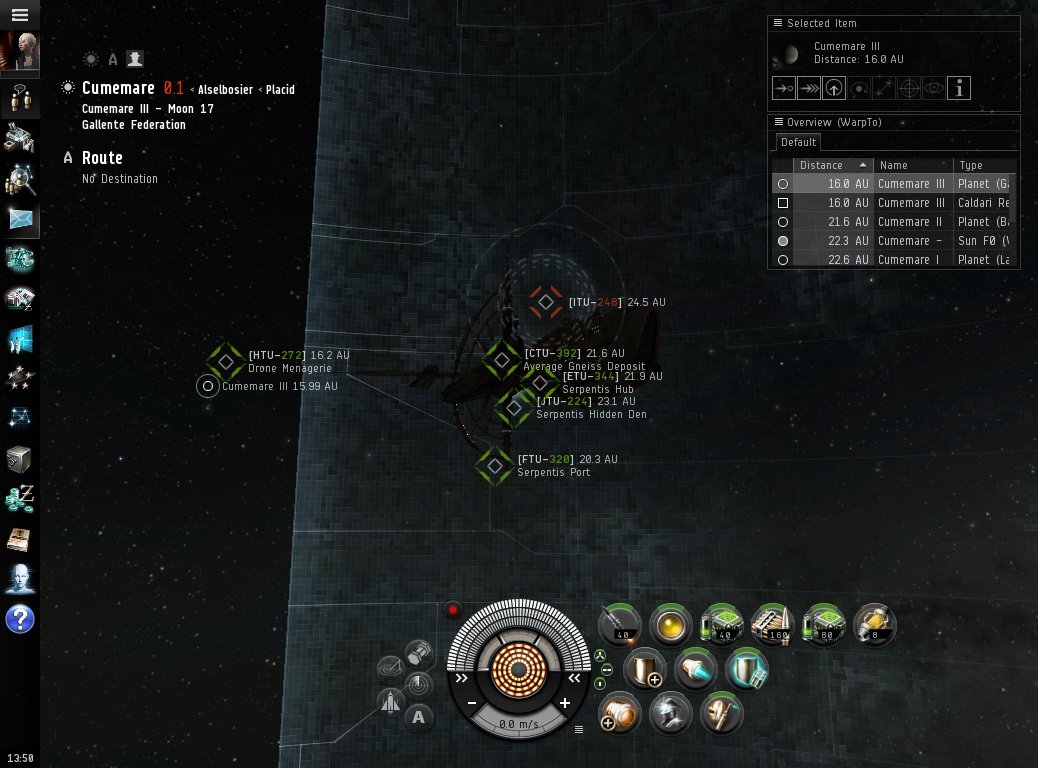
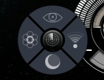
The sensor overlay is controlled via the scanner button in the ship HUD (Head's Up Display). When you press the button you encounter a new radial button menu. From there you can enable or disable the sensor overlay by pressing the eye icon on the top. You can also access all the specific scanner tools directly from there; probe scanner, directional scanner and our beloved moon scanner as well (which may be in high demand in the coming days and weeks). The radial scanner menu works as a pop up menu as well as a gesture tool like the new radial menu for ship actions where you can press the button and drag in a direction to select a button and release to select it.
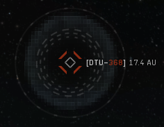
The icons for the sites that appear on the overlay are different for anomalies and signatures. They differ both in color and in shape. Common to both is the rough diamond shape and a label showing the scanner identifier code and the estimated distance to the site. The anomalies appear as green diamonds and also show the name of the site although capped since the names can become really long and just clutter the screen. The signatures are red and have animated circles around them indicating the uncertainty about the site both in terms of location and content. The pixelated haze around the signature sites indicate roughly the area in space where the true location lies, the bigger the circle the less certain we are… or it’s just closer to you. The haze is limited to never become too big on the screen. When you scan down a signature to 100% signal using scanner probes the location will update, the haze will go away and you get the name of the site like for the anomaly icon.

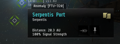
When you mouse over a site icon in the sensor overlay a popup hint appears by the icon giving you more details on the site. The amount of information depends on how good a scan signal you have. For anomalies you always get a perfect result. Here you always get the full name and the faction of the site I provided the signal quality allows for it. You also get a distance to the site. Also we provide a few instant actions if applicable such as a Warp-To button taking you to 0 km or a button to save the location for later use. For the signatures we also provide a probe scanner button that automatically launches probes, opens the scanner and switches to the solar system map.
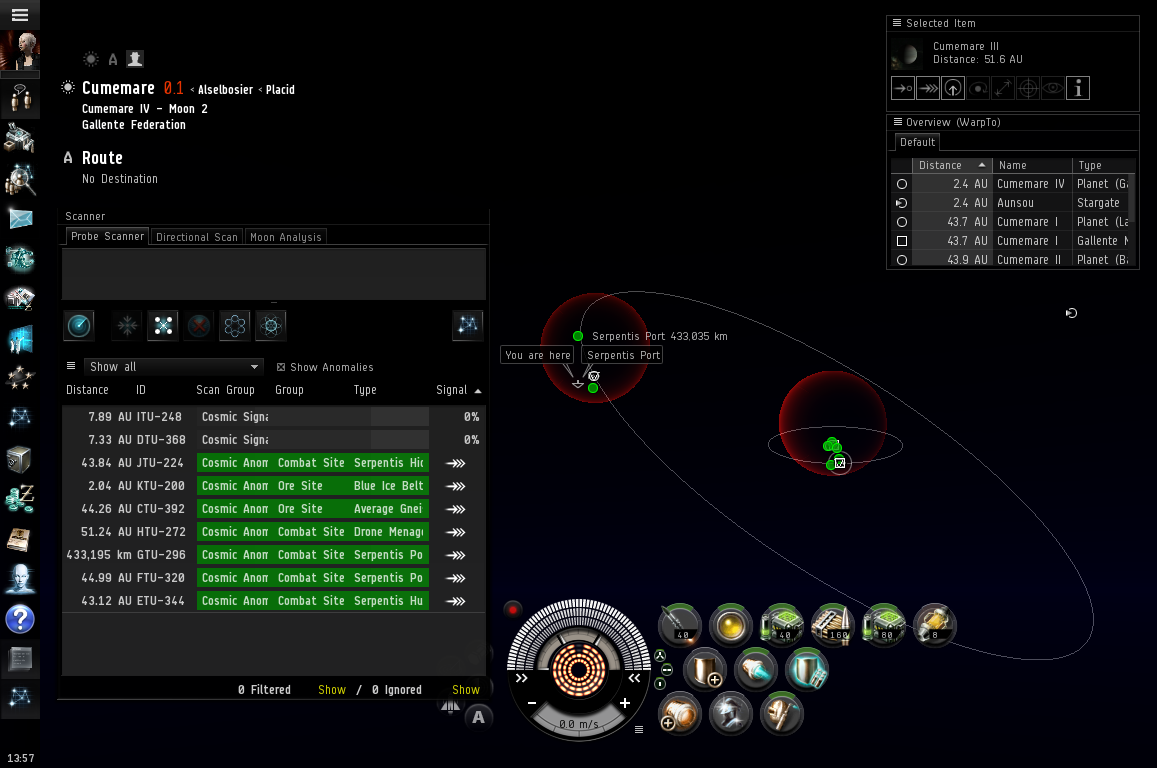
As this feature is intersecting the probe scanning mechanics as well as serving as an introduction we have tried to integrate these features a bit. To begin with we are priming the probe scanner with all the anomalies as well as crude signature results that you can view in the probe scanner result list right after jumping into a new solar system. This allows us to retain a list view of all the sites and also gives us an interface to view all the sites in the solar system map as results from the probe scanner. When you open the map with the probe scanner window active in a new system, even with no probes deployed, you immediately see the anomalies as green warpable results and the signatures as red spheres indicating their approximate locations. In addition we update the icons in the sensor overlay as you improve your scan results. The signal gets better and the name and faction gets filled as appropriate. Finally when you have a perfect hit we update the location and enable the warp and save location buttons on the overlay site hints. You also have access to the options to ignore sites in the probe scanner from the overlay icon context menu.
To wrap thing up CCP Greyscale has some concluding remarks.
In order to integrate this functionality smoothly into the existing tools, we've made a number of decisions that change elements of EVE. We have, for example, changed the gate-jump process to include an extra, non-blocking step: the overlay running a quick scan sweep in the new system to give you a glimpse of what might be hiding in deep space. We've changed the way that information about new sites appearing in a system can be accessed, which is particularly relevant in wormhole space. We have, in conjunction with Team Superfriends and as a side-effect of other work, made it harder to rapidly determine exactly what classes of site are present in a given system.
These things, and more, will be different when Odyssey hits, and we're fully aware of that. There were some changes that we were considering making that we backed away from, because they were not just different, they were also bad. The significant changes that are left are the ones that we have kept because we believe that they will, in aggregate, make the game better. We will of course be keeping a careful eye on things post-release to see how these changes end up working in practice, and making adjustments where necessary. For now though, we encourage you all to embrace – or at least tolerate! – the changes, and see how they work out in practice before settling on a final opinion.
There are also some areas where we certainly want to expand and improve at a later date. Specifically we want to address how to go about selecting overlapping icons in the overlay which we acknowledge can be a bit of a pain in very site heavy systems. Currently the probe scanner integration mitigates that to some extent but we want something nicer closer to home. We are also looking into moving more content into the overlay but more on that when the time comes that in itself will compound cluttering issues requiring a solid solution to that.
But enough future music, here you have it, the sensor overlay. I hope you will enjoy the changes and find them useful and enlightening in your journeys across New Eden.