Hi everyone,
I'm CCP karkur, and I'm here to tell you guys about a number of Little Things my team, Team Avatar, is bringing you in the next point release. But first let me introduce myself:
I'm a UI programmer and I've been with CCP for almost 4 and a half years, yet this is my first dev blog so please be nice :). During my time here, I have worked on various features and systems, including EVE Mail and the Skill Training Queue, and also fixed A LOT of bugs (I know… bugs? In my EVE? Never!). Most recently I've been working on our lovely Character Creator, which is something I really enjoy 🙂
Shortly after the release of Crucible, CCP Soundwave posted a thread where he asked you for all your little things. That thread is now over 100 pages, and I spent a few nights reading over a lot of your posts (wow, you guys write a lot) and wrote down all the small UI suggestions that I found interesting and thought would be fairly easy for me to implement.
Then, on a beautiful Sunday evening, when I had compiled a long list of your ideas (both from that thread and other threads) and prioritized it, I fired up the client and my awesome TextPad, and started trying out stuff to see how much work was needed to take the changes all the way. I might even have implemented a few of them right there and then, but as all changes like that need to go through the proper channels, the team planned them in our next planning sessions, and then the final touches were made.
Anyway, you are probably more interested in what we are actually bringing you than all this blabbering… so let's get to the good stuff:
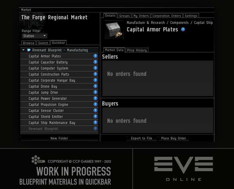
A number of you wanted to be able to drag a blueprint over to the Quickbar and get a folder with all the materials needed for that blueprint.
When I started implementing this, I felt the ability to drag inventory items to the Quickbar was sorely missing, so I added that first. Then I found that there was a small problem with non-market items, as they were not allowed in the Quickbar. Wouldn't it be nice to be able to bookmark such items to do "Show info" on them later, or search for them in contracts? Well, now you can add them like any other items, by dragging them over to the Quickbar or by using the right click menu. They will be greyed out so there should be no confusion why you cannot load the market details for them.
Speaking of contracts… when I had added the non-market items to the Quickbar, I realized that I should probably make it easier to find stuff in contracts from the Quickbar, so I added proper menus to the Quickbar items.
Click to enlarge
Sooo, back to the original task… the blueprint folder. Now you can just add the blueprint to the Quickbar while holding down SHIFT, pick the job type, and then, voilà, a folder that contains all the stuff you need for that job as well as the blueprint itself is created in the Quickbar!
Click to enlarge
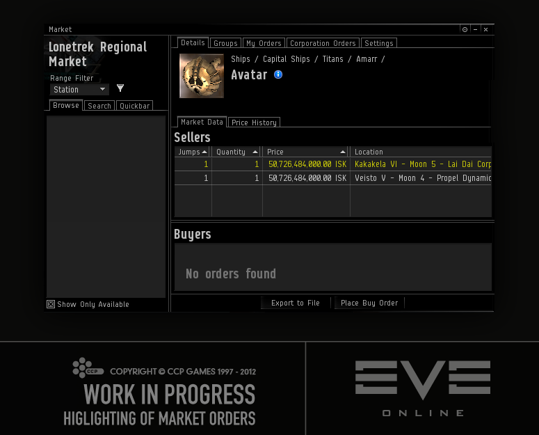
One of your ideas that I really liked was to highlight the market orders that are in your route. So now, the text in the orders that are in your route will be colored yellow.
Click to enlarge
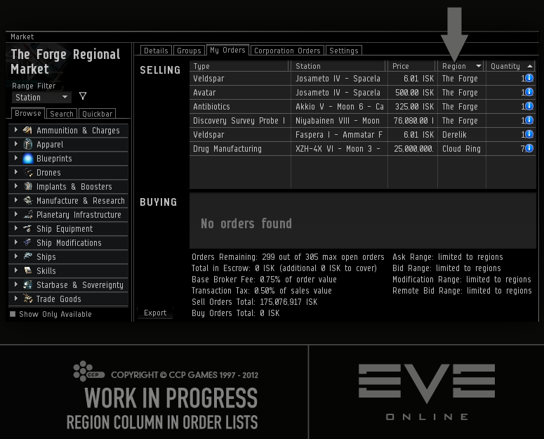
You asked for the ability to sort your orders by region, so an extra column, "Region", has been added to those lists. The column that used to be called "Location" has been renamed "Station".
Click to enlarge
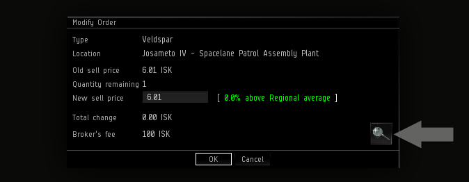
Then when you asked for a "Show Market Details" button in the "Modify Order" window, it just made so much sense that the button had to be added.
Recently a player on the forums discovered an awesome new tool, the Compare Tool. Well, it's actually been around for years, but I still managed to convince a few people that it was brand new, and tried to take all the credit for it. My friends in that thread asked for a shortcut for it, so a shortcut they get 🙂 An optional button for the Neocom will be added soon when an icon for it has been made.
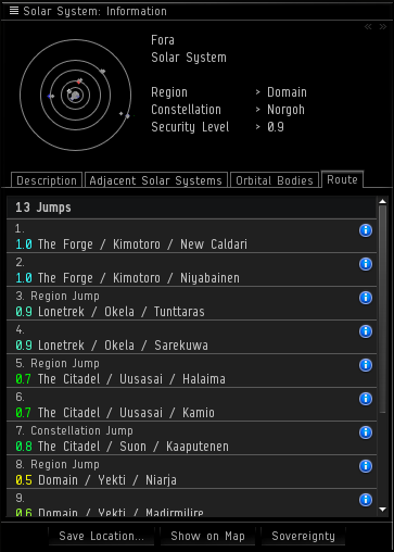
So, you know how when you do "Show info" on a solarsystem, you get a route tab that lists the solarsystems you must go through to get there? Well, currently the list does not give you a whole lot of info on how dangerous that route is, but soon it will, as you will have color coded security level in front of the systems' names, and also text that tells you how many jumps are in the route.
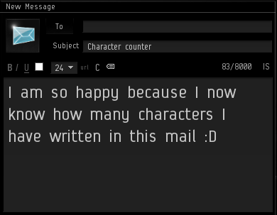
I personally hate it when I'm writing a long fan mail to CCP Punkturis, and I'm just about to get to the good stuff when I realize I've reached the character limit… how I wish that I had something to give me a hint on how much more I could fit in that mail! Based on your forums posts, I'm not the only one running into this, so I added a character counter to Mail, Bio, Notepad and other similar text fields.
(You will notice that the Notepad counter behaves a little bit differently than the rest, as it also counts the invisible tags you add, but that's because the Notepad is very strict on its character limit.)
Other small changes you asked for:
- Sort order of "number of items" in your asset window has been changed, so now the stations with the most items will be listed first, instead of all the hundreds of stations where you only have a rookie ship or some other not-so-interesting items
- "Show info" is now in the right click menu of someone who is chatting
- Right click menu has been added to the image in the "Selected Item" window
- A non-useless right click menu has been added to the materials in the reactions' "Show Info" window
I hope you like all these small changes and I hope we can continue making small improvements like this on the side, because we do have a long list of stuff we want to change and fix and improve for you 🙂
That's all for now. Until next time, fly safe! 😀
– CCP karkur
Catch CCP Karkur and the rest of the UI gang at Fanfest 2012 where they'll be hosting a roundtable! More information on Fanfest topics, tickets and travel can be found here.
New to EVE? Start your 14-day free trial today.
Returning pilot? Visit Account Management for the latest offers and promotions.

