Hi!
Team Super Friends has been working on some Little Things for Retribution 1.1. We decided to focus a bit on making the war experience better since there were a few things we knew we could do better. Now lets get to it!
War Things
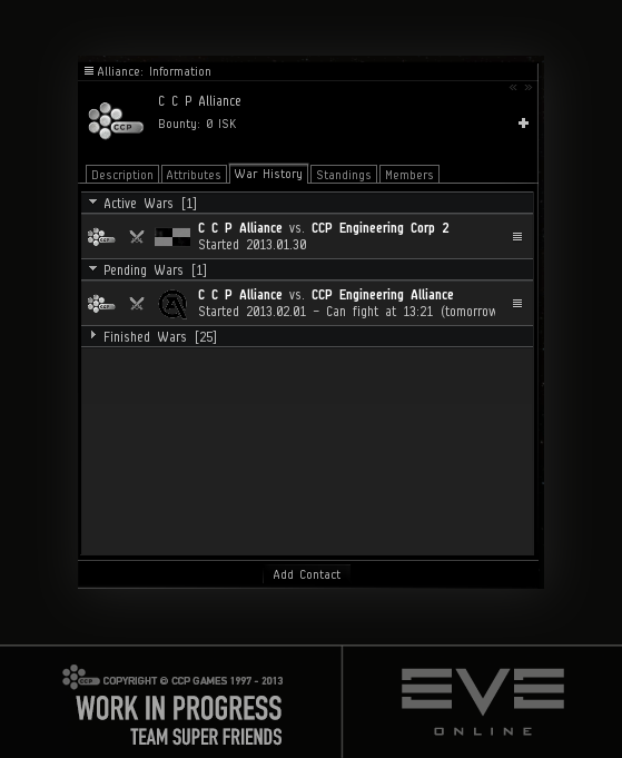
Group wars in the war history
The war history in the info window for corporations and alliances was getting kind of crowded for active corporations/alliances. So we now group the wars by:
- Active Wars
- Factional Wars (active)
- Pending Wars
-
Finished Wars
War cost
Inactive characters don't count in war cost any longer.
Allies join war faster
Currently, allies have to wait 24 hours to join a war.
Ain't nobody got time fo dat!
Let's make it 4.
Naming and shaming
When it comes to dealing with wars, it is impossible to know which character in a corporation took some actions. We've now added notifications that are sent to directors of the corporation/alliance, which tell you who did the following things:
- Declared war
- Offered surrender
- Accepted surrender
- Made war mutual
- Retracted a mutual war
- Offered to ally
- Accepted ally
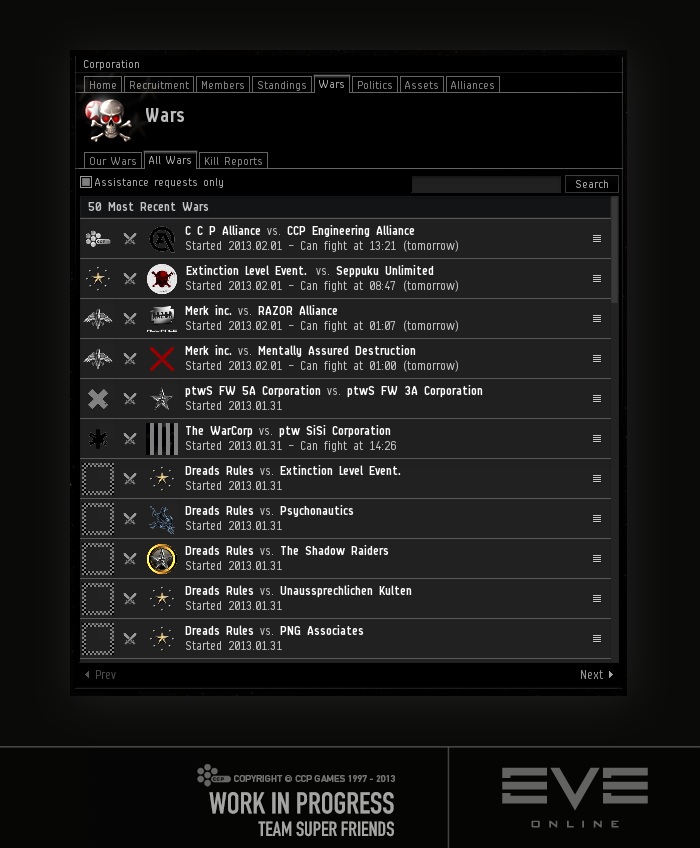
Browsing wars
In the all wars list in the corporation window you could only see the 50 most recent wars. That's no fun! So we added paging so you can browse all the wars, 50 at a time.
Forced Peace
To make the surrender option in a war more meaningful, we've now made it so that if one entity surrenders to another, those two have a forced peace period of two weeks.
Other Things
See corporation and alliance logos clearly
When looking at the most wanted alliance and the top bounty hunting alliance in the bounty office we realized there was no other place you could see alliance logo in that size in the client. Since most of them are really cool and a lot of work was put into them, we made it so that when you click the alliance logo in the info window, you'll see a larger version of it (without the WANTED banner for wanted alliances).
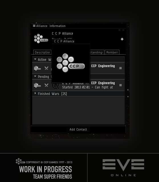
We did the same for corporation logos because it makes sense
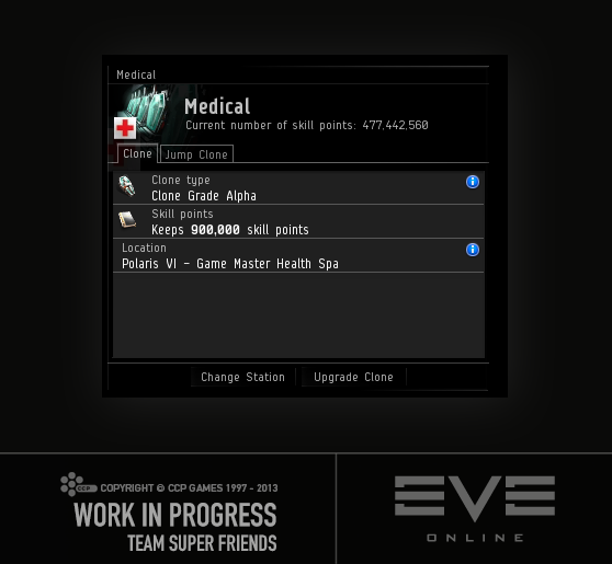
Current skill points in Medical window
Your current number of skill points wasn't being displayed in the Medical window for some reason. This had been annoying me for some time until I figured.. wait.. why don't I just add it? So that's what we did!
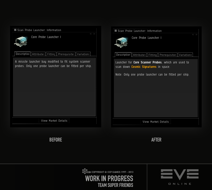
Better descriptions
Tuxford was playing EVE and got lost in some exploration fun and told the team about it. He was so angry he was about to press the big red button, so we decided to do something about it quickly.
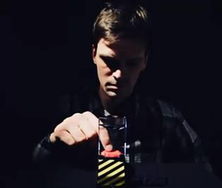
Tallest convinced us it would be a great idea to give the exploration probes and launchers better descriptions so you can easily read what they do in very simple terms. No Big Red Button was pressed.
(Click To Enlarge)
That's all for now, fly as safe as you like and party on!
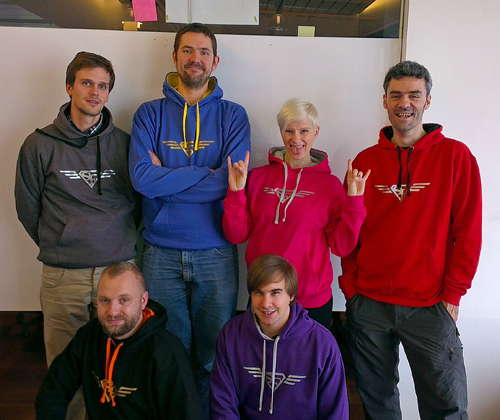
Punkturis on behalf of Team Super Friends (missing SoniClover in the picture)
New to EVE? Start your 14-day free trial today.
Returning pilot? Visit Account Management for the latest offers and promotions.
