Hi all
As some of you active forum warriors might know, CCP Soundwave posted a forum thread about a year ago where he asked you to suggest "Little Things" changes. That is, very small changes to the game that would make your life as an EVE pilot just a little bit better. Since then you guys have really stepped up to the plate and posted thousands of ideas. I think it's kind of nice to read through it now and see we have actually implemented many of your suggestions. Recently we felt, however, it was time for a fresh start so we adopted this thread as the "Little Things" thread; so if you have good suggestions, please post them there 🙂 While we have a new thread, the old thread is of course not forgotten.
I have spent a whole lot of time reading through your many, many posts in these two threads and noted down the stuff that interests me, and my list is pretty long and still growing.
So today I'll be telling you about a few of these small things that are coming your way in Retribution:
I want to start by telling you a short story about a feature you asked for that is actually already on TQ but which is fairly new and we haven't really mentioned yet. So, about two months ago I found this awesome feature on my local server, a feature I have wanted for quite some time and had even started to implement. I was a bit surprised, checked Tranquility and sure enough it was there, but not on older reference servers. I went around the office asking people if they knew where it came from but no one I asked knew anything about it. I even checked my devblogs and there was nothing about this feature there. Then finally I checked the code history, and felt super silly when I found out that it was in fact me who had implemented it (how can one be expected to remember what happened before summer vacation?).
Anyways (cool story bro), this neat (and easily forgettable) feature is to be able to drag the icons in the Show Info window and drop them in chat or other similar text fields. This works for items, characters, corporations, certificates, etc.
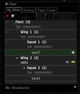
Have you ever been in a fleet and tried to find yourself in the hierarchical view? Well, it can be kind of tricky. After Retribution it should be pretty easy to see what groups you belong to and find your place in the list because your wing and squad will be marked with green arrows. You will also be highlighted with a green background.

And how freaking annoying is it that whenever you go to repair something, you get a long list of pretty much all the stuff you have ever owned in your entire EVE career as well as in your real life*, whether it's damaged or not? Pretty annoying I would say. In Retribution we are changing it so only the items that are actually damaged will be listed. So no more "I'll just repair all because I can't be bothered to find what I need to fix right now" for me (and probably you too) 🙂
* this might be a slight exaggeration
One of the things you've asked for is for the Character Sheet to remember the page it was on last time it was open. I've recently started to get some actual kill reports (yay, so much fun blowing up ships!), and this little thing has been driving me a little bit crazy when I've wanted to see the newest kill report. So I was more than happy to make this change 🙂
Another pet peeve of mine that I fixed… the fitting management window will now open on the category I was using the last time, so now I don't always have to switch from my crappy personal fittings to my corporation's ones to access all the quality fittings.
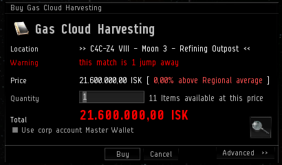
And for my marketeers: your right hand will not much longer have to travel to the backspace button every time you want to buy more than 1 of some item. After Retribution the default quantity "1" will be highlighted, so all you have to do it punch in the quantity you need and hit Enter.

Another thing that you've suggested is the ability to browse back and forth between the items you have been viewing on the market. This is something my forgetful brain has wanted in the game for quite some time, so I thought it would be perfect to just add it 🙂
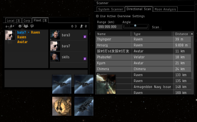
When I've been out roaming with my corporation and have had to tell my corpsies what I see on the directional scanner I've thought to myself "If only I knew someone who could make it so I could just drag this stuff to chat." Guess what? I don't only know someone but actually I am someone who can do just that. So, because I can't pronounce ship names and am a slow typer (and because it's just convenient), we will all be able to drag the interesting stuff from the d-scanner to chat and create show-info links there. We decided to list the items only by their type names to save space in the chat, but each link will link to a unique item. That means that if the ship linked is on your grid, you will be able to see who is flying it.
Earlier this year I added color coded security status to a few places where solarsystems were listed. Some of you wanted the same in the Show Info window on stations, and that just made sense so I made it so.
In addition to all of this we kept some of your targeting wishes in mind when my team, Team Pony Express, was working on the new targeting changes:
First thing I want to mention is that now when you hover over a module on your HUD, you will see what target that module is active on. A really faint hairline is drawn from the module on the HUD to the bracket in space and to the corresponding module below the target (and the module there will also be highlighted).
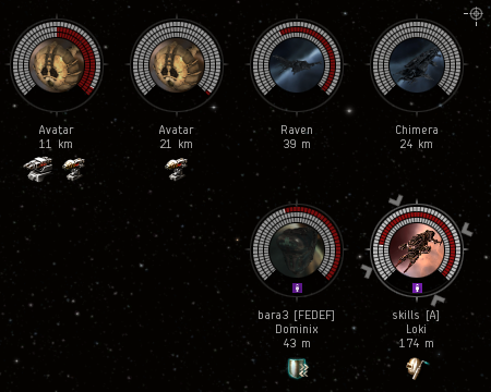
Another thing I hope you will appreciate is that you will be able to have multiple rows of targets. That means that you logistics pilots can keep your friends in one row and your enemies in another row.
Previously, as you probably know, the targeted ships where in the order they were targeted, and a new row was only added when there were too many targets to fit in one row. In Crucible we changed it so you could actually change the order of your targets. Now we are taking a step further and allowing you to move your targets to new rows, even if you only have two targets.
The targets will still be aligned to left/right/top/bottom depending on your settings, and they will always be added in the first available slot (top row in the default settings). Once a target is put in a row, that row will be their home unless you change it. That means that targets should not be jumping from the second row to the first row just because some targets in the first row were lost or destroyed.

I hope you like these changes, and believe me, we have a long list of changes we want to make for you guys 🙂
Until next time, fly safe,
– CCP karkur
New to EVE? Start your 14-day free trial today.
Returning pilot? Visit Account Management for the latest offers and promotions.

