*For optimal results read the following message in an Australian accent*
The following Australian glossary may be required: http://www.koalanet.com.au/australian-slang.html
G’day mates, I'm CCP Sisyphus from Team Pony Express, here to give an update on what you should expect from this team in Retribution.
Our goal this year has been to give you a better understanding of the battlefield so you spend more time doing your thing and less time trying to work out what the bloody hell is happening. We’ve made a lot of progress on this front, however that progress accompanied the realization that we had Kangaroos loose in the top paddock not every new feature was meeting our goals.
Your feedback has helped us come to this conclusion and we’ve been scrambling to sort it all out. This means we've made a few changes; The new design for targets which we showed on Duality solved some problems but introduced others. For this reason targets and brackets are now getting a familiar layered look, just like your own HUD.
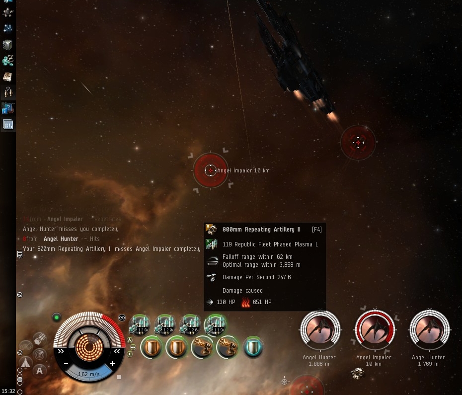
This is also tied in with the damage indicators that we've been working on. We tested a version on Duality which roughly indicated the severity of hits but your feedback indicated this was as useful as an ashtray on a motorbike of nominal usefulness. Since then we have changed the design so that a HUD indication shows "who has the highest DPS on me". It makes determining who is really hurting you much easier, however it stood out like a dog’s balls looks very different from other UI elements so we’re still working to ensure that this has a true look and feel of EVE. So you dont need to fossick through the forums, I'll have a skite on tell you about what we're releasing in Retribution:
Click for larger version
- New Camera Mode that will keep both you and your selected item on screen. Don’t like manually panning around space trying to locate where your dastardly foe is? Want to quickly work out what’s the nearest point out there to align your sluggish freighter to? Then this mode is for you.
- Restyled Targets and Brackets that contain more detail but are recognizable because now they look like your HUD
- In-Space DPS indicator so you can see which bastard is giving you a bloody nose
- New Damage Notification stream. Now you can see multiple damage notifications simultaneously and move the messages around to wherever you feel they look best. Warning and General notification messages (white text on TQ today) are now displayed in a separate area and they are movable as well!
- When you mouse over an active module you see a hairline link to it's target, and the weapon on the target lights up. Bonzer!
- Corporation Finder UI upgrades to make searching for corporations easier, as well as matching Corporation advertising upgrades to help you better communicate to potential recruits what your corporation is all about.
- Corporation application management improvements to help you keep track of which corps you have applied to, and who has applied to your corporation and who has let them in.
- Heaps more Info on Module Tooltips!
- Resistance types on hardeners. Once you get your mitts on these goodies we’re sure you’ll be grinning like a shot fox!
Hooroo for now!
