PART ONE: WHAT'S GOING ON
It's always been a core principle of EVE that the more active, engaged players we have, the better the game will be. EVE is a deeply social game at its core, and having more people to interact with gives more opportunities for interesting outcome (see: Metcalfe's Law).
One of the major benefits to EVE of DUST514's upcoming launch will be the increased awareness of and interest in our shared universe, and we're expecting an influx of new players as a result of this, which is great (see above). And then someone said "yeah, but won't they all have to play through the tutorial?", and we all thought back to our own experiences playing the EVE tutorial at various points over the years, and went "uhhhhhhhh… yeah…"
In *totally unrelated* news, Team Five 0 was recently tasked with a one-month mission to improve the tutorial as much as possible. This is the story of that mission.
Stage One: Analysis
The first thing we did was to look at the overall problem and determine scope and goals. Our data experts rolled out their graphs, we pored over them and asked lots of questions, and it quickly became clear that the biggest pain point right now is the initial tutorial arc, which loses an awful lot of people before they've even begun to play. The career path missions aren't perfect either, but players who've got to that point have usually already decided that they enjoy the game and want to keep playing.
Confining ourselves to just this initial tutorial string gave us some useful limits on our work. Based on our knowledge of previous tutorial adjustments, we quickly came to the conclusion that rewriting it from scratch wouldn't yield good results in the time available, so we added the further constraint that we didn't want to change the actual tutorial missions more than strictly necessary. This gave us a clear framework to follow, while giving us the flexibility to make adjustments within that framework.
With those goals and restrictions in place, we next pursued two avenues of research. The first was to dig into the existing metrics for tutorials to look for obvious statistical issues. Here, for example, is a graph of the existing tutorial string, showing approximately how many people quit after each tutorial stage.
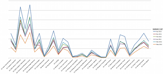
This graph shows, for each tutorial stage, how many players quit after starting that stage but before starting the next one.
As you can see, the current tutorial string has some good spots (most notably fitting and the bit where you're blowing things up), and some bad spots (most notably the bit right at the very start where we try to teach the skill queue before you've even undocked). Data like this gave us a pretty good sense of where our trouble spots lay.
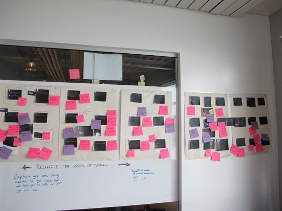
While this data-gathering was taking place, we were also spending time digging into our other avenue: playing the tutorial. Alongside this, we also printed out every page of the tutorial and storyboarded the entire string in one of our meeting rooms. The notes from our playthroughs were then stuck onto the storyboard, so we could get a clear visual sense of where we were identifying lots of issues, and what was problematic at each stage.
Stage Two: Planning
With both our own analysis and a big stack of data in hand, we quickly collected a pretty long list of assumed problems with the current tutorials. From this, we began sketching out the major changes we wanted to make. Some sections needed to be moved or broken up, some dropped entirely, and additional teaching needed to be added in some cases. We decided to try and focus the tutorial as much as possible on teaching you how to use the game client and the core tools (piloting, fitting, skill training and so on), relying on the career paths to teach more specific skills.
The end product of this was a lot of additional post-its on our storyboard outlining the changes we wanted to make, and then a short written task-list of things to change. These tasks were split up among designers and programmers, and then we got to work.
Stage Three: Implementation
Everyone put their heads down and worked through the task-list. This is the unglamorous bit of game development!
Stage Four: Evaluation and adjustment
Once we were done with the main implementation work, we went through several rounds of user-testing with external volunteers. As you'd expect, we learned an awful lot from this, and came away from each session with long lists of adjustments to make.
A key example of this is how we teach in-space commands. We'd assumed initially that using visible UI functionality would be better than relying on context menus, so we endeavoured to teach with the Overview and Selected Item as much as possible. Repeated user testing showed that new players were far more comfortable right-clicking on everything, to the point where later tutorial steps that forced players to rely on Selected Item were tripping them up because they had no idea how to use it. This experience led us to rework our teaching throughout the tutorial to use right-click and the context menu, which subsequent testing confirmed as a much smoother experience.
Stage Five: Release it and see what happens
These changes will be released as part of Inferno 1.2, at which point we'll get to see what actually works in practice, and whether there are any trouble-spots that need further improvement. We've beefed up our logging capabilities as part of this work, so we should be able to see very quickly if there any problems, and react to them as needed.
PART TWO: WHAT WE'VE CHANGED
Overall Approach
- Voiceovers are gone for now. We really like them, but as soon as the text stops matching up with the audio it's incredibly distracting, and it's not feasible to continually re-record them as adjustments are made. Until such time as we can get a really good text-to-speech implementation (which we are actively looking at), they're out.
- >We're now attempting to teach everything one way (right-clicking stuff where applicable, for example), and reinforcing that method as often as possible.
- We avoid teaching keyboard shortcuts. We use icons and pictures where applicable.
- We highlight important things in the text. We always ensure that we have a clear header describing what's on the page.
- We always have a line at the bottom telling you when to click Next.
- We've removed automated progression and progression limits entirely from the initial string, and tied all the tutorials together in a single string: you can now use Back and Next to page through the entire string with no breaks or restrictions.
Tutorial Structure
- At the start, we now tell players roughly how long the tutorial will take and what they'll get out of it.
- We no longer teach Incarna-specific functionality, as right now it's not necessary to play the core game.
- We've split skill training up into two sections, moved it to later in the tutorial, and are no longer attempting to teach the skill queue interface.
- We now teach camera controls outside the station (where there are lots of other players to see) rather than on your own at an acceleration gate.
- We've removed the first acceleration gate from the first mission, as the double gate in that mission was confusing our playtesters.
- We've removed the huge stations from the end of the first mission, as they were making it very hard to locate the cargo rig objective.
- We're more careful to teach basic UI stuff like closing windows you don't need.
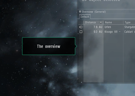
- We now explicitly teach the Overview, Selected Item and brackets.
- We've adjusted shield regen on Rookie Ship a little, so that tutorial NPCs no longer have any chance of killing them.
Changes to Tutorial UI
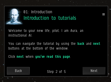
- The tutorial window has been completely overhauled:
- The look and feel is all-new, and now relies on a nice green hue rather than bright yellow everywhere.
- The tutorial window now auto-resizes for each new page, to eliminate scrollbars. This can be disabled by manually resizing, and re-enabled using the settings button on the window.
- The tutorial can now be minimized.
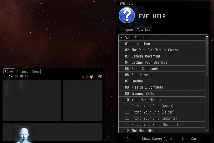
- The tutorial now has its own button on the Neocom; if you close the tutorial, this button will re-open the tutorial at the point you left off. As a result of this, we've also got rid of the "are you sure" pop-up and replaced it with a (closeable) tooltip on the Neocom button explaining how to reopen it. The Help button on the Neocom is now a big blue question-mark; the old "Aura" icon is now used for the Tutorial button.
- The pointers have had a visual overhaul, bringing them in line with the new tutorial look; they also now have a shimmer effect to draw visual attention.
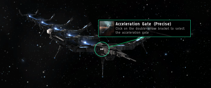
- We now have dead-sexy in-space pointers that we can attach to things like ships and acceleration gates to help players locate them. They attach using a pretty cool bungee effect, and also highlight the item on the overview so you can find it there too.
- You can now drag tutorials into chat for other players.
Supporting UI Changes
- Constellation chat is no longer active by default.
- Overview is now sorted by distance by default, rather than by icon.
- Hybrid Charges are now referred to as Charges everywhere ingame, rather than as Ammo in some places.
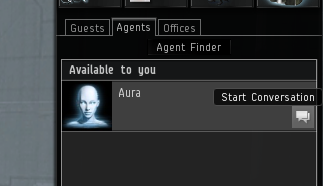
- You can now talk to agents using a button, rather than having to right-click.
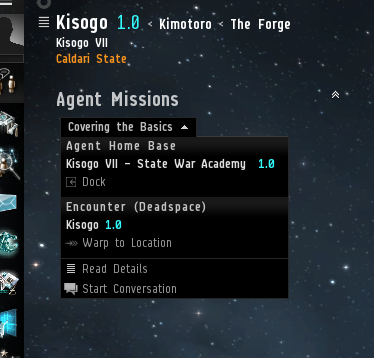
- You can now get information on mission objectives using a handy panel in the HUD, allowing you to warp to locations without having to rely on the Journal or context menu.
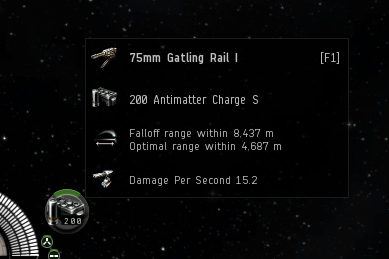
- Module tooltips have been substantially revised to show just useful information that isn't already clear from the module icon. (And yes, these include module and charge damage, and work with turrets, missiles and other ranged modules such as EW or remote repair.)
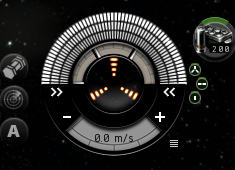
- Full Speed and Stop Ship icons on the HUD are now + and – rather than two triangles; this does not strictly describe their function, but should make them much more easily discoverable by new players.
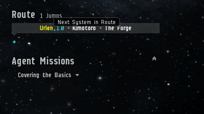
- You can now warp/jump to the next stargate from the Route panel in the HUD
PART THREE: WRAPUP
Most of this should be on Singularity as we speak; we're continuing to make minor adjustments as small issues come up, but at this point we're pretty much done. Please go and experiment, and give us any feedback you can think of!
-Greyscale
