Hey there.
We are CCP Optimal and CCP Arrow and between the two of us we should be able to make excellent projectiles, but let’s keep this focused, shall we? Instead, and more importantly, we try our best to make your experience in EVE good through various UI improvements. In this dandy little devblog we want to tell you about the latest developments coming from our dear team, Game of Drones (patent pending).
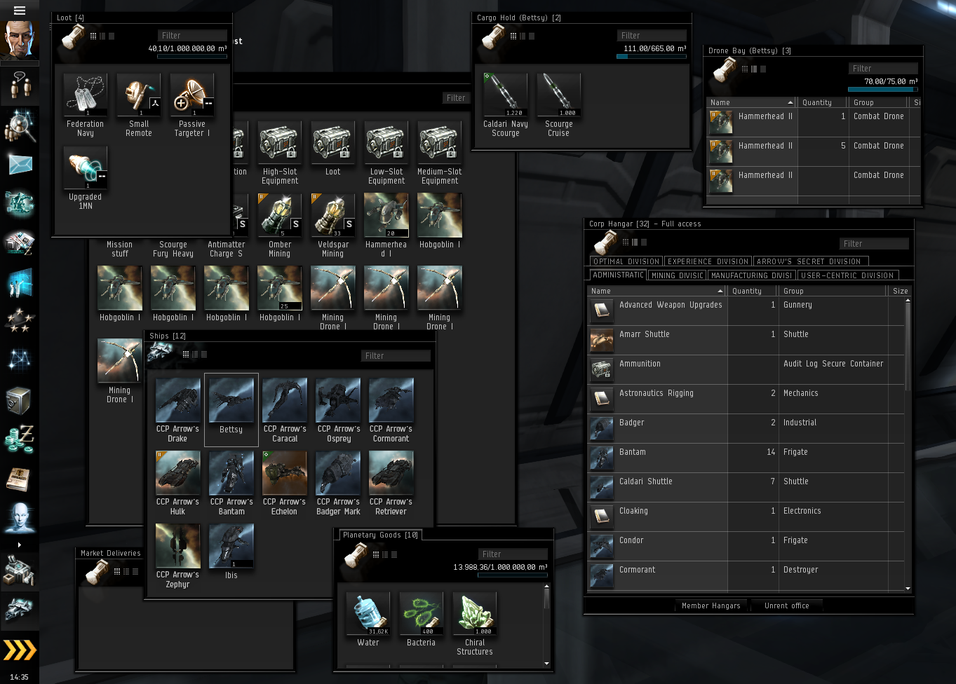
What do all EVE players have in common? They need to use Inventory windows. A lot of them…
Click to enlarge
As we mentioned before, we are on a crusade against the amount of open windows it requires to pull off any given operation in EVE. A little research, as well as our personal experience, made it clear that the inventory UI was, and to this date is, a big offender in that context. There are tens of different types of inventory location in the game, and in many cases you will find the need to have many of them open at the same time. We also recognized that there were many usability issues to be encountered by users of the inventory system, so spending time improving it made a lot of sense. Additionally, the nature of the inventory system means that all players use it more or less every time they play the game. It doesn’t matter if you are a carebear, a diehard PvP player or a casual corpse collector (wait, what?), the need to manage your items is always present.
The remedy
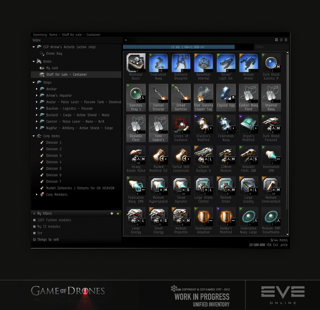
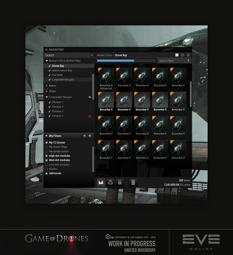
So, what’s the opposite of multiple windows? After weeks of research and multiple rejected hypotheses we came up with what we are certain is the correct answer: a single window (please tell us it’s the right one). So, instead of opening up multiple windows from multiple locations spread throughout the UI, you now have a single Inventory button in the Neocom. Once pressed you will be presented with a little something like this:
Click to enlarge
The most obvious change to the inventory is the new tree view, which automatically populates with all inventory locations accessible to you at a given point in time. As if that wasn’t a tough enough job, the tree view is also populated with any sub inventory location, so under your active ship you will see all bays present, under Ships you will see all your assembled ships and under Corporation you will see all the divisions accessible to you (the ones that you don’t have read access rights for are hidden). Oh, yeah, it also shows containers, effectively making them quite usable, as opposed to the biggest usability violators in the history of videogames. It should be obvious that you can now move items between inventory locations without opening the destination window; just drop it to the relative tree view entry instead. If you prefer, you can drag and hold an item over the tree view entry to switch over to that inventory location to see the item appearing safely at its destination, although there is also a confirming blink when dropping onto an entry. You can also drag containers between locations within the tree, making life even easier.
If this “One window to rule them all” doesn’t sound like the thing just for you then don’t panic, you can still open up multiple windows if you want to (either through right-click options or SHIFT clicking tree entries), but we are hoping the need to do so is all but eliminated with the introduction of the tree view.
What else is in the goodie bag?
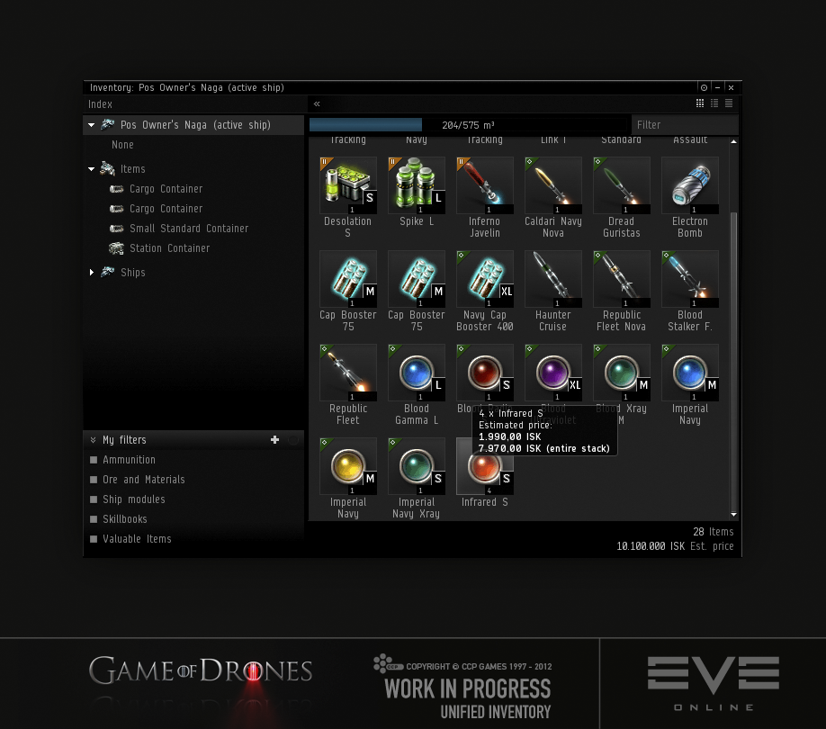
Another big usability issue we noticed when analyzing the inventory was the lack of inventory management related information. To amend the situation, we beefed up the capacity bar, which now not only shows the used and total volume of an inventory location but also the volume of the selected items, both the absolute volume and proportional amount (as a second bar on the gauge). When dragging items between locations, the bar will also show you how much volume the items will take up, and turn red if the items won’t fit, before you even drop the items. On a similar note, we now also show the total number of items as well as the number of items selected, in the bottom-right corner. Since we’re there (the bottom right corner that is) you may have already noticed the number of items’ jolly neighbor, Estimated ISK price. That’s right, we finally came to the conclusion that we had enjoyed watching you all jump through flaming loops to figure out the worth of your stuff for long enough. It was fun while it lasted. When you have items selected, the number will represent the summed up value of those items, but when nothing is selected it will be the entire bunch. The ISK price of individual items, as well as of the entire stack, can also be enjoyed by hovering over that item. The estimated ISK price is based on the items’ average market price and will therefore probably not represent the exact value you’ll get for it on the market, but it should be pretty darn close.
Click to enlarge
Filter heaven
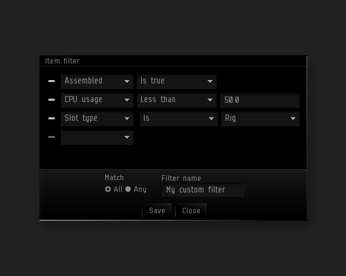
As you seemed to like when we added the quick filter box to the inventory not so incredibly long ago, we figured you might enjoy if we introduced more advanced filtering as well. Just to avoid confusion, we kept the Quick Filter box which has its use for quickly filtering things by name, but for more advanced filtering we added a new feature we call Smart Filters. These are powerful filter rules that can be configured in multiple ways and saved to be used again at any point. Heck, they are even persisted to the server, so you don’t have to re-create them on every god forsaken PC you may end up logging in through. Currently, the conditions available in a filter are:
- Assembled
- CPU Usage
- Estimated unit price
- Group
- Meta group
- Meta level
- Name
- Power usage
- Slot type
- Stack size
- Volume
It is effectively possible to create a very simple or complex filter, depending on your needs. While the filter creation window remains open, the filter in construction will be applied and updated as you mess around with it, so you can do complex filter operations without saving anything. If you do manage to build a filter that would make your parents proud, you can name it and save it, making it accessible under My Filters for some quick filtering action until you decide to send it to Filter Heaven (or Filter Hell, depending on its behavior) by removing it. A green diode will light up when any of your filters are active. You can click that very same diode to quickly disable all filters. When filtering is active, the number of items filtered out will also be displayed in green in the bottom right corner. There will be a couple of pre-defined filters present when you first open the window which you can butcher at will through the Right-click edit option. We have a hunch that some of you might want to change the 100k threshold of the “Valuable items” filter…
Click to enlarge
Inventory in space
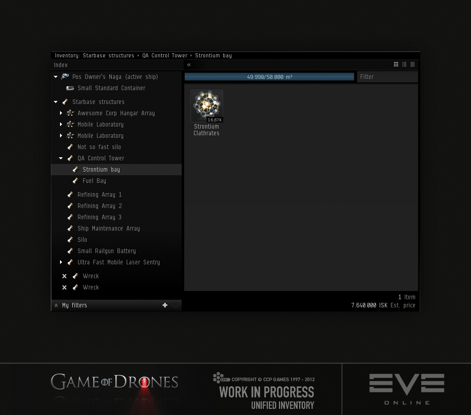
Most people know that in space, no-one can hear you scream. What you might not know is that in space, there are also Inventory locations/holds (ok, to be fair you probably knew). We quickly realized that the tree view promise of always displaying all inventory locations accessible to you at a given time would become a bit fuzzy when in space. Should we populate the tree with items outside of reach that are still on grid? What about ship corporation hangars and ship maintenance bays? What about situations where there are hundreds of wrecks or other inventory locations, most of which you might not be interested in at all? After a lot of thought, we decided to hand the power to you. In-space inventory locations will not automatically pop up in the tree, but require you to open them up yourself as before. Once an inventory location has been opened, it will appear in the tree where it will reside until you decide you’ve had your fun with it and click the little white X to remove it. The only exception to this are POS structures, that are automatically appended to the list under a POS Structures category once you’re on the same grid, which we felt made much more sense as those inventory locations are in a sense way more permanent than wrecks and floating cans.
Click to enlarge
I love it when you get all technical
Well, who’s blaming you? The biggest reason we hadn’t brought you any of the above improvements earlier was the fact that the client inventory code had fallen victim of some serious code rot. Being one of the fundamental systems of the game, that also makes it one of the oldest and this oldie was long overdue for some refactoring. So, refactor we did. Once that was done, we had solved a couple of key issues such as properly separating data from UI as well as making the Inventory UI way more modular than it was before. Without this foundation work the Unified Inventory window would never have been feasible. Another thing we looked at while the hood was open was performance. As any large scale item possessor will tell you, dealing with more than a couple of items would bring the frame rate through the floor. But no more! Having hundreds of items within the same location now works fine. The time it takes the Inventory to load up for the very first time has also been reduced, plus we’ve added loading indicators to make it clear that your client is waiting for its data, which should be especially useful in a ‘laggy’ situation.
The Inventory of the future
As the inventory system is one of the most heavily used systems in the game, and most games for that matter, it cannot be stressed enough how important proper functionality and usability is. Keeping that in mind, it is easy to argue that time put into improvements is time well spent and we don't want to stop there. We value your input and would like to know how you feel about these changes. What more can we do to improve the experience of managing your inventory? To name a few things we would like to iterate on in the near future; some even smarter Smart Filters, such as “Skills training met”, “Can be fitted to active ship” and so on (give us more ideas please). We plan to break out a lot of the per-item options that are now hidden in a right click menu to proper icon buttons. Among those options are functions like ‘Sell’ (multi-sell anyone?), Assemble, Trash and so forth. Right-clicking is fun and all but … yeah.
Click to enlarge
That’s all for now from Game of Drones. All of the things above will be hitting our test servers very soon, so stay tuned and have fun doing Inventory stuff.
